Experience a new clarity and focus
We released Invotra 5.50 on Friday 17th July 2020
We’ve released a total of over 1000 tasks for Invotra 5.0.
Major changes
Material design
Invotra 5.0 is the systematic modernisation of our product using Material Design.
We’ve established a visual clarity and content hierarchy that’s more approachable and friendlier to use for all our users. Invotra 5.0 is a major update that will get the best out of an increasingly flexible, knowledgeable and efficient workforce.
With Material Design, we’ve also created the conditions for all future product development.
Invotra 5.0 sees the seamless adoption of Material Design in all of the product’s visible and accessible User Interface (UI) components and layouts, including behaviours and performance indicators.
These changes, which run across desktop, tablet and mobile screens, include navigational flows, menus, filtering and ordering standards, as well as the positioning and relationships of all Invotra components.
From 5.0 onwards, we will continue to establish and refine the Invotra product using Material Design principles, with a focus on the reduction and simplification of the user experience.
Accessibility
By transitioning the components and layout first, we ensure the building blocks of Invotra are ready for assistive technologies and are easy to use.
You can expect to see a dramatic increase in quality as the components are used and reused, while being tested at a single point means great accessibility is replicated throughout the system.
Workbar
When you first login to Invotra 5.0 the most noticeable difference is the workbar. That is, the navigation along the top of the screen we used to call our toolbar.
Depending on your role and permissions, you’ll see 6 or 8 icons.
Webmaster tool bar
![]()
Organisational user toolbar
![]()
The workbar is ever-present, designed so you can quickly get to the information you need. Hover over each icon and you’ll reveal what it is and does, whether it’s the directory, apps or feed.
We expect users who already work with Invotra to reorient themselves without too much trouble. However, should you have an issue, please check out our free online guidance resource — Invotra Developer.
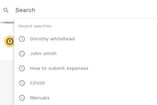
Search
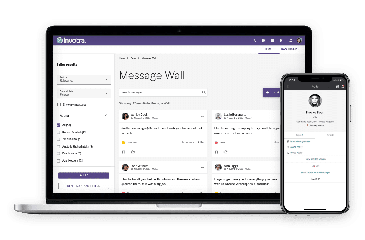
Search is one of the most important and used features in our product. In Invotra 5.0, when you select the search icon, a search bar takes over the workbar to reduce cognitive load and increase focus on results.
Results are categorised into content, people, teams and locations as before, but everything is clearer and more spaced out. The search experience is still customisable, but now more manageable due to the addition of ‘Apply’ and ‘Reset’ buttons.
You also have the option to ‘Show more’ or ‘Show less’ in results. This reveals the section, content type and breadcrumb of the result, along with other details depending on the search category; confirming it’s the result you want or not.
With search: titles, summaries and body copy are what count. The terms that trigger results will be emboldened for users. We encourage content creators to ensure these fields are accurate and tested.
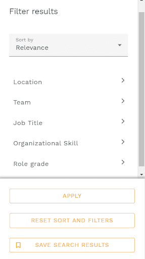
Filtering results
In the new search, directory and app screens, as well as my content and manage content that have replaced my workplace, there is a new filter and sort channel.
When users have chosen their filters, they select ‘Apply’ and a new and more accurate list of results and content will appear. If the user wants to go back to the original set of results, they select ‘Reset sort and filters’.
Staff directory
Another new icon in the workbar, directory is home to people, teams and locations, as well as the org and team charts that visualise an organisation’s structures.
Whether you’re looking for an individual in a particular team or want to know where the highest concentration of developers are located; the directory makes this information available to everyone.
In Invotra 5.0, every user’s profile is displayed in cards with quick access to their contact details.
Profile details can be updated in a matter of seconds from a user’s profile, like before, which then automatically updates the directory.
Search for a team in the directory and you’ll see if that team is part of another team, the number of team members, its common skills and team’s locations. All details can be selected, for example, select members to see and search the 335 members.

Profile menu
Naturally, you’ll be drawn to your profile image in the top right of the screen. We’ve removed the username to tidy up the workbar and reshuffled what you can access from your profile menu.
To access your profile, you simply select ‘View profile’ from your profile menu. An example of making the user experience clearer and more obvious wherever we can. Previously, a user had to select their name.
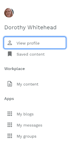
The list of links in the profile menu has been re-prioritised. ‘Saved content’ moves up following customer feedback highlighting a need for quicker access to frequently visited pages, as well as those to return to later.
Workplace leapfrogs apps too. If you’re a publisher, you’ll see My Content and Manage Content, whereas if you’re an organisational user, you’ll only see My Content. We’ll talk more about these new areas next.
Apps have been thinned out, and you can jump into your groups, messages and blogs without having to go through app landing pages from the workbar. It’s quicker, it’s clearer and it will be further refined in the future releases this year.
My Content and Manage Content
Workplace previously incorporated feed, notifications, my content and all content (manage content). In Invotra 5.0, feed and notifications are separate so users can now focus on their content and the content they manage as publishers.
My content is solely concerned with a user’s activity. Whether you’re saving content, creating your own content, following people or content, or interacting with content with comments and ratings. Your dashboard highlights the numbers to give you an instant count of what’s going on where.
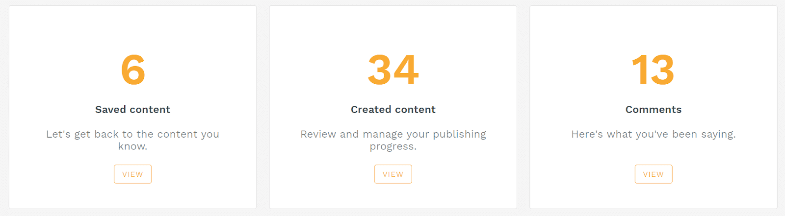
If you find yourself with a few zeros, you’ll be prompted as to why activity in these areas can be useful to improve your all-round experience on the intranet. They’re also a useful reminder of what’s possible with the information on your intranet.
Manage content is where creators and managers go to access their workflow, moderate comments and content, as well as manage files.
You can choose to show or hide filters on the left hand side and access each category using the local tabs below the workbar. It’s been designed to increase the amount of space for users to find and focus on what they’re looking for.
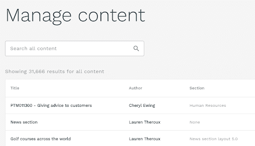
There might be 100s or 1,000s of content types to search through, with a big decision to be made when you do find your content. Manage content brings clarity to help improve decision making and collaboration in the product.
Fluid and flexible layouts
Invotra screens such as directory, search, my content, app landing pages, etc., all now adopt a fluid layout. That means they will expand to 1,440 pixels.
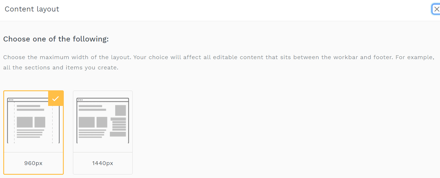
Now though, when users create their screens, sections and content types, you’ll be given the option to have a fluid or fixed layout. A fixed layout only expands to 960 pixels.
Setting a preference for layouts helps to ensure the quality of your designs and content output, while complementing an enterprise’s individual IT capacity.
Widget configuration and settings
The building blocks of Invotra are now simpler to use and give you more control over the details. Instead of choosing from 24 fixed configurations, you first pick from 8 styles:
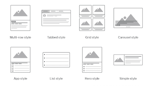
Next, you choose the details you want to include. Be it an author’s name, date, social shares and more. Expanding what’s possible with widgets for content creators.
What’s more, the design updates we’ve made to every widget in the product will significantly enhance the aesthetic appeal of your current intranet overnight.
The next phase of development for widgets includes a refresh of all language, including titles, categories and guidance.
Apps experience
Invotra apps bring people together in Groups to collaborate, on the Message wall for shout-outs and in Ideas to help drive positive change in an enterprise.
As we’ve done throughout Invotra 5.0, our apps have been simplified and are now a single screen experience. Where once users could access three tabs that included ‘explore’ and ‘my app content’, the use of filters has consolidated this experience.
If a user wants to review their app content, they check ‘My content’ in each app. If a user wants to search for a specific group or message, they use the local search bar. Dashboard for content creators, remains the same as the only separate location in any app.
A change in tone of voice
Following Invotra’s visual transformation is a change in voice and expression.
Naming, help text, tooltips, buttons and more, are being reviewed and reworked to make the new user experience even better.
This is all to come in Invotra 5.1 to 5.5.
Clear and obvious quality
We’ve been driven throughout this project to deliver an experience that’s clear and obvious for every user.
Wherever you go in 5.0, you’ll see a reduction and simplification in design that sets the standard for all future product development.
We’ve strived to create the best conditions for professionals to do their best work. To continue to be an enterprise’s source of secure, stable and structured information.
And when it comes to collaboration – open, engaging and inspiring.
Simply, information at work.